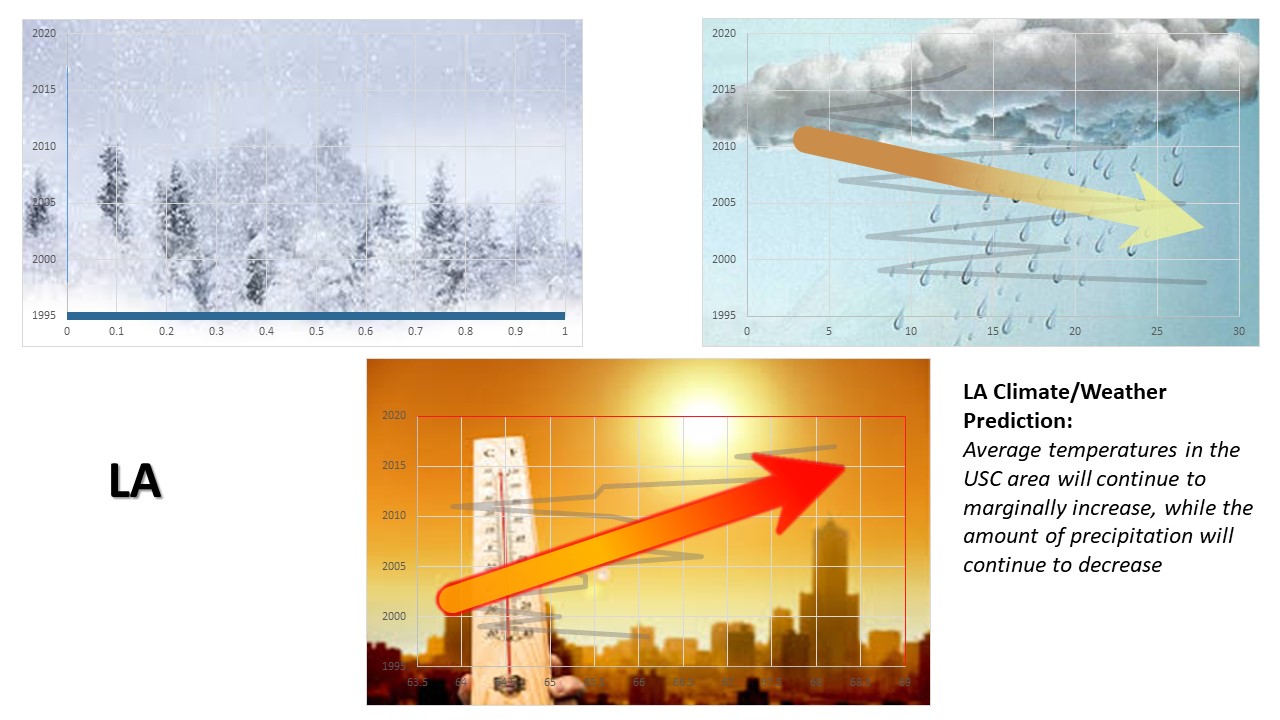
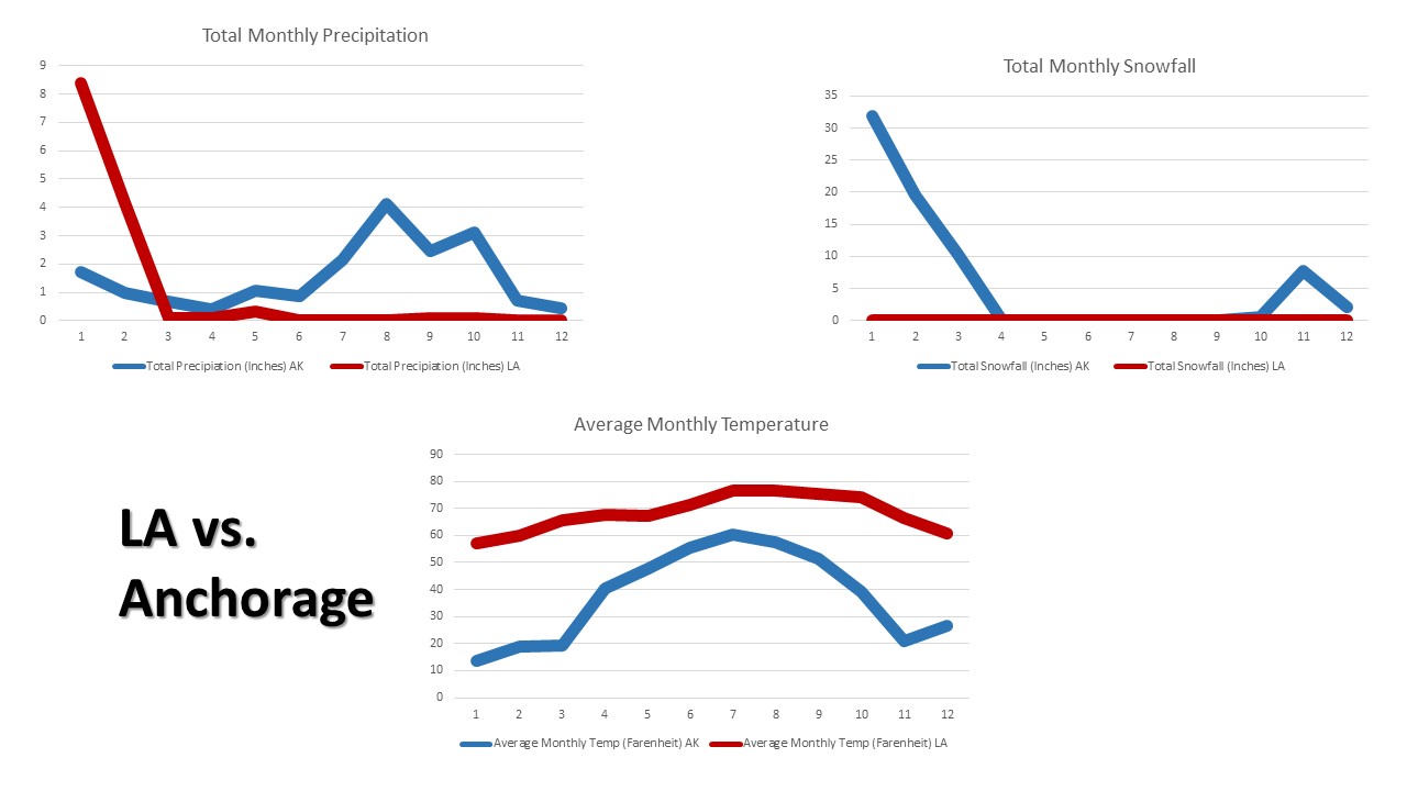
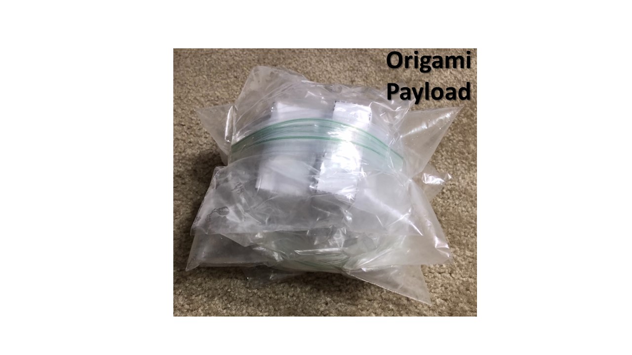
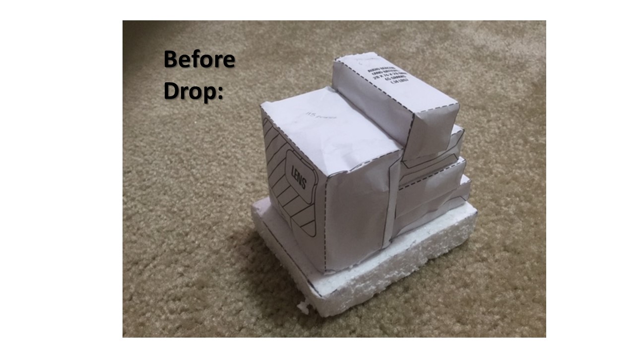
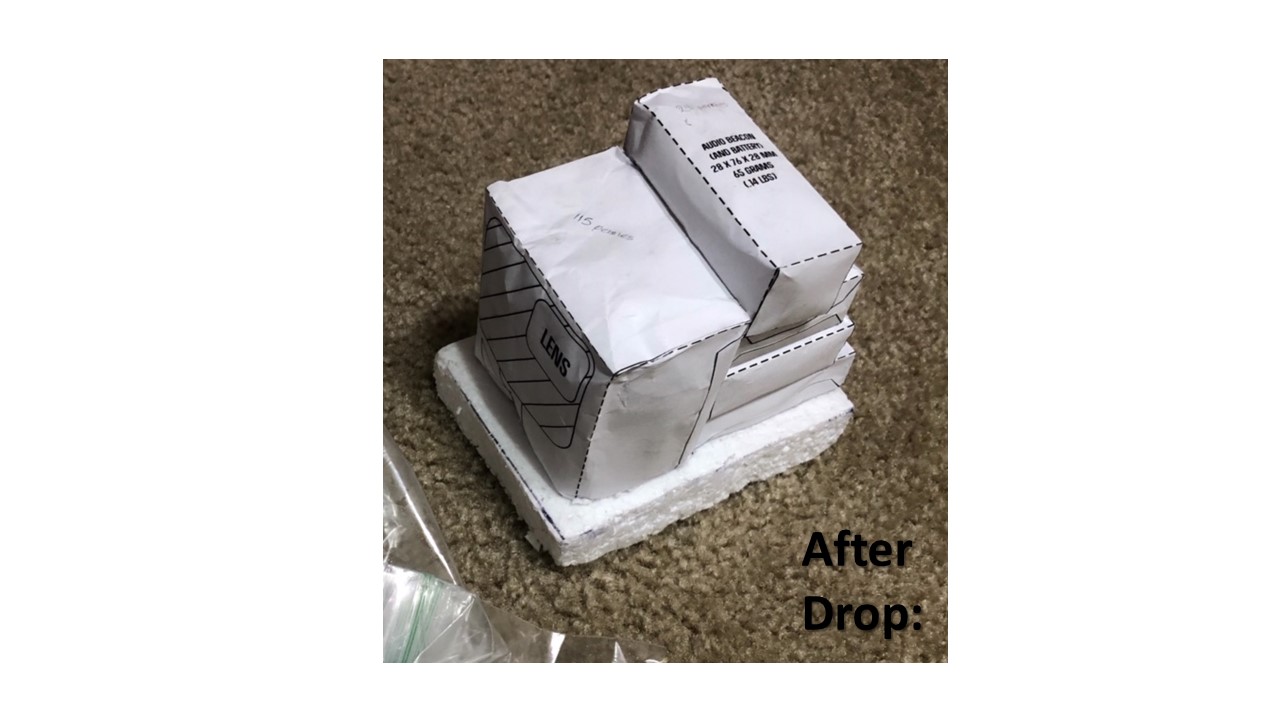

In my entry, I have shown two pictures of visualizations. The concept I had when creating the visualizations for LA was to show what the overall trend of the data was, and presenting the information in the most universally understood form. In the end, the charts represent three basic aspects of LA's climate: the average temperature, total precipitation, and total snowfall. For the comparison, I tried to show the contrasting patterns between LA and Anchorage, Alaska; which is why the charts show each data point in 2017. For my payload, the design, in fact, is quite simple: afix all of the sensors and components onto a common base, and wrap the base and senses with air pillows (like the ones used in shipping items). How is this origami? Well, like the paper art form, the air pillows overlapped each other in order to fully surround the entire base. As for the air pillows themselves, I made them by inflating plastic Ziploc bags and taping them together into groups of four. Finally, the insides of the mock-up components were made by stuffing the paper boxes with equivalent weight of AA/AAA batteries in place of pennies (as I could not get that many pennies) and cotton balls.
Contact us
Thank you for your interest in contacting Future Engineers. We look forward to connecting with you!
General Inquiries
support@futureengineers.orgSponsorship Inquiries
sponsor@futureengineers.org